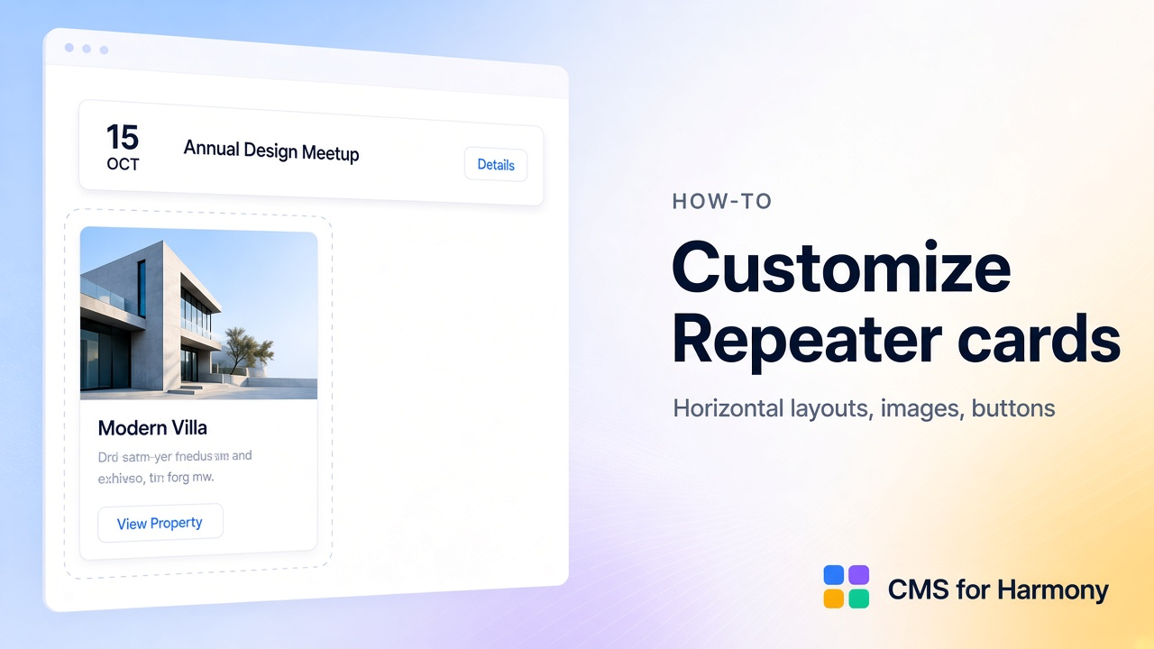
Connecting a collection to the Repeater is only half the job. The other half is the layout inside each card—where the image sits, how dates and buttons align, and what happens when a description is long or a field is empty.
The short setup checklist is How to make a card grid from CMS. This guide is the practical companion: grid vs in-card layout, three worked examples, image fit, clipping, empty states, buttons, and mobile—without wiping a design you already like.
Grid of cards vs layout inside each card
| Layer | What it controls | Where in the panel |
|---|---|---|
| Repeater layout | How many cards per row, gaps, list vs grid | Layout → Repeater layout |
| Card layout | Arrangement of fields inside one card | Layout → Card layout (Preset or Custom → Arrange fields) |
| Formatting | Per-field empty behavior, number/date display, image-related options | Formatting |
| Design / Mobile | Chrome, typography, mobile breakpoint behavior | Design, Mobile |
Changing columns on the page does not by itself create a horizontal “row” inside a card. For event schedules, property teases, and job rows, you usually need Custom card layout (or a preset that already matches).
Docs: Repeater · Field formatting.
Sample collection fields (shared ideas)
Most card designs reuse a small set:
- Title / Name
- Image or Cover
- Short text (summary) and optional long Description
- One or two meta fields (date, price, location, type)
- Optional URL or Dynamic Page button
Worked example 1 — Horizontal event row
Goal: Each race or event reads left → right: date, title + venue, DETAILS button—not a product-style image gallery.
- Connect an Events (or Schedule) collection.
- Under Layout, set Card layout to Custom and open Arrange fields.
- Place Event date on the left, title and short details in the middle, and a DETAILS control (Dynamic Page link or URL) on the right.
- Prefer a List or single-column Repeater layout when each card should feel like a full-width row.
- In Formatting, set long Description to collapse or hide on the card; put the full text in Quick view or the item page.
Worked example 2 — Property card
Goal: Photo on top (or left), price and beds/baths scannable, Inquire or View button.
- Map Cover image, Title/address, Price, Beds, Baths, City.
- Use a Grid Repeater layout with consistent card width.
- On the image field (or card background), set Fit to Cover for cropped hero photos; use Contain when you must show the full floor plan without cropping.
- Set aspect ratio / sizing so every card’s media block is the same height—mixed ratios make the grid look uneven.
- Link the card or a button to the Dynamic Page listing URL.
Industry walkthrough: Real estate listings.
Worked example 3 — Job listing card
Goal: Title, employer, location, employment type, Apply button—dense and readable.
- Map Title, Employer, Location, Employment type; keep Description short on the card.
- Custom-arrange so Apply sits consistently (often bottom or right).
- Use When empty on optional Salary so missing values collapse instead of leaving a blank gap.
- Pair with fixed publication filters from the job board guide.
Images: contain vs cover, aspect ratios, sizing
| Fit | Best for |
|---|---|
| Cover | Lifestyle photos, property heroes, product shots where crop is OK |
| Contain | Logos, diagrams, full vehicle side views you must not crop |
| Stretch | Rare—only when distortion is acceptable |
Tips:
- Pick one fit for the whole list so cards feel like one system.
- Set a shared media height (or aspect) in Layout / Design so short and tall originals do not break the grid.
- For Card background from an image or video field, set Fit, Focus, and a Fallback color for items with no media.
Long text, clipping, empty fields, buttons
- Long descriptions — Show a short summary field on the card; put the full body in Quick view or the item page. Clip or truncate only when you intentionally want a teaser.
- Empty fields — In Formatting, use When empty: Collapse (preferred for optional salary/location), Hide (keep space), or Show placeholder.
- Buttons — Keep Apply / Details / Inquire in the same place on every card. Dynamic Page buttons stay tied to that action when you reorder other fields.
- Targeted edits — Change one field’s Formatting or rearrange Custom placement without reconnecting the collection or clearing Search & filters. Avoid “start over” unless the card structure is wrong end-to-end.
Mobile layouts
- Open Mobile on the Repeater.
- Choose whether to keep the desktop arrangement or simplify (stack fields, fewer columns).
- Set the Breakpoint where the mobile layout starts.
- On a phone-width preview, check that buttons stay tappable and horizontal desktop rows do not crush text.
Optional AI setup shortcut
AI setup can propose field order and a starting layout from a prompt (“horizontal event row with date left and Details right”). Use it to draft, then refine with Arrange fields and Formatting. Re-check mobile after any AI apply.
Live-site verification checklist
- Publish and open the page on desktop—card interiors match the intended pattern (row vs stacked product card).
- Spot-check three items with missing optional fields—no awkward empty gaps if you chose Collapse.
- Confirm image fit (no unexpected crops or letterboxing).
- Resize to mobile width—layout switches cleanly; buttons remain usable.
- Click Details / Apply / item links on two different cards.
Related reading
FAQ
Is Cards a separate widget?
No—in CMS for Harmony, “cards” means a Repeater layout.
Will Custom layout reset my filters?
No. Arrange fields changes in-card placement. Search & filters and collection connection stay unless you change those sections yourself.
Can each card use a CMS image or video as the background?
Yes—set Card background from an image or video field, then choose Fit, Focus, and Fallback color. Cover vs Contain and empty-field behavior are configured under Layout / Formatting on the same Repeater.